Showing posts with label watercolors. Show all posts

Wednesday, January 27, 2016

Watercolor for Cardmakers--Intermediate Class

I'm taking another online class, and after only three days I'm in information overload.  I started this class late, and now I'm in catch-up mode.

The first class had us using one of our dies to outline shapes in pencil for an all-over background.  The teacher used a pear shape, which I don't have.  I looked through my dies and found this leaf die, and drew my leaf shapes on Canson Cold press 140 lb Watercolor paper.

I painted one of the shapes with clear water, and dropped in several colors, and let the water blend them.  I then moved on to the second leaf, and tried again, going from leaf to leaf.
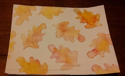

The first one (upper right) didn't really look good to me.  I had added drops of cadmium yellow mostly in the center, then a couple of drops of a green I had blended from cadmium yellow and ultramarine. 

On the other side of the leaf I added drops of alizarin red.  When I tilted the paper the red and yellow sort of formed an orange, but I didn't like the way it looked. When I added a little more water to the yellow, I think it had already dried a little and lines showed up.  And I don't know how the yellow dot showed up.

The next one I did (right side, just under the first one) turned out better.  There is just the one spot that seems to have a harsher line than I intended, but I can see the improvement.

The rest of them I rather like how they turned out.  I used more water on the paper as I went along, and I see that the last couple are a little too pale and blended for my taste, probably because there was too much water to begin with.

To make my card I trimmed down the watercolor paper to 3 3/4 x 5 inches (which eliminated the leaf I didn't like), then matted it with a nice reddish brown.  I tied a ribbon around it, and popped it up for a little dimension on my brown card base.  I think it turned out pretty well.

The die I used was from Dare2B Artzy, and the paints were Windsor Newton Cotman watercolors (tube).


Tuesday, September 29, 2015

Watercolor Class Day 2--paints--One more card

I stamped a flower design I liked with VersaFine ink, and the sentiment.  I then attempted to color in the flowers with my tube watercolor paints ( Winsor-Newton) using crimson.  I diluted with water quite a bit to go over the flowers, and then when dried, went over again with a slightly less diluted paint of the same color to add some shading.


All in all, I think it came out fairly well.  I've never used these tube paints before, and found them a little intimidating at first, but just pushed on, and I feel that the result is a lot better than I had envisioned!

Monday, September 28, 2015

Another card colored with my watercolor pencils

This was based on one I'd see somewhere, I can't remember exactly where--perhaps on Pinterest, or on one of the Facebook pages I'm a member of.  In any event, they had taken the snowman and made him into a wobbly card, which I thought was cool looking.  As I wanted to do a little more with my InkTense pencils for my Watercolor for Cards class from Onlinecardclasses.com, I chose that medium to color my snowman. 


I stamped the snowman on two pieces of watercolor paper, and colored both of them with my Derwnt InkTense pencils.  I cut out the best looking one, attached a wobbly spring to the back, and added to my card front.  It is really cute in real
life!


Saturday, September 26, 2015

Another card with watercolor pencils

Using a few stamps from Peachy Keen Stamps' Lisa Jean Halloween set, I made a little Halloween scene with matching sentiment.  After stamping with VersaMark, I embossed with Zing! Opaque Black embossing powder.

My watercolor paper warped some during the heating process, but I managed to mostly flatten it out again before attempting my water coloring.  I used Derwent Inktense pencils, and tried to use a light touch, and it seemed to go okay.

I was attempting to do a little shading, and it was a little harder than I had hoped.  The cauldron didn't come out exactly as I had pictured it, but I guess it isn't too bad.  I thought the face turned out pretty well, but it doesn't show that much in the photo.  In real life, you can see it is darker around the edges, and lighter in the middle.


Thursday, September 24, 2015

Online Card Class: Watercolor Day 2--paints

Went back and watched the Day 2 videos again, and decided to try the "dreamy" background.  I used Prang Oval 16 semi-moist watercolors on Canson Watercolor paper.

First I did a light yellow wash, and after it dried, I added some more yellow, let it dry, and then a third layer of yellow.  I decided what the background needed now was a little orange, so that was next.  When the orange was dry, I used the brush to flick a few yellow droplets on top, and then some orange droplets.

I stamped with black VersaFine Onyx Black a Tim Holtz saying, Be an Individual.  I had to stamp it twice, and it it didn't make a great impression on the watercolor paper.

To finish it off, I matted it in yellow, and used foam tape to attach to the off white card base.

I was pretty happy with the way the  background came out with the layers, and using the traditional paints wasn't as hard as I thought it would be.

Wednesday, September 23, 2015

Online Card Class--Watercolor Day 3 Watercolor Pencils


I didn't get a chance to watch the Day 2 videos until last night, so didn't do any water coloring yesterday.  Today, the Day 3 videos were available, so I watched them this morning.  As I had just received my Derwent Inktense ink pencils, I was eager to try them out, so I skipped the pan water colors for today.  I'll be trying some of the techniques out for that tomorrow.

I had this idea to emboss some watercolor paper with a butterfly folder I had on hand by Darice, and then color in the design with the pencils before spritzing it with a light mist of water. 


As it turned out, some of the colors bled into the background a little, and I had to use a brush to aid in the blending I had imagined.

I also wasn't happy with the blending on the largest butterfly, so I added a little more color and used water on a brush to blend it.  All in all, after it dried I liked how it turned out.

I stamped a Thinking of You Sentiment from My Sentiments Exactly in Hero Arts Pool ink in the upper corner, matted it on avocado green card stock, and used foam tape to attach it to a cream colored card base.

It was pretty obvious to me that I need to practice quite a bit on my coloring with the pencils, as I don't seem to be using consistent pressure, causing some places to be darker than others.

I'll be doing some Day 2 cards with pan watercolors shortly, and probably some more watercolor pencil cards.


Tuesday, September 22, 2015

Another card from Day One

This was made from the second watercolor strips card I made on the first day of class, and I was hoping it would turn out a lot better than the first one I'd done, as I was using a better watercolor paper.  However, I couldn't really see all that much difference, and so I was a little disappointed.


Looking at it, I thought I'd cut it down into a circle and stamp a flower on it.  Using the Simon Says Stamp largest Stitched Circles die, I cut out a nicely colored section of the strips.  I then used Onyx Black VersaFine Ink to stamp the flower stamp on the circle.  I attached it to the center of a white A2 card base.

When I stamped the Thinking of You I tried to curve it a little to match the curve at the bottom of the circle die cut, without being too obvious about it.  I think it turned out pretty well.

Monday, September 21, 2015

Another card from my Day One experiments


I took another of my first day experiments, which I didn't think turned out very well originally.  By turning it upside down, I thought it looked like a beautiful sunset, so stamped some trees in Onyx Black Versafine Ink.  I trimmed off some of the watercolor card where it had pilled before stamping, and then matted the card with black card stock. 

I had to do quite a bit of touching up on the bottom of my stamping, where I apparently hadn't pushed down on the stamp enough, but I think it turned out pretty well.

I was going to make this into a sympathy card, but I'm not sure if it is a little too bright for that.  I'm going to give it some thought.  Maybe I'll make it a thinking of you or missing you card.  The sentiment will go at the top, I think, although I left a little room on the bottom for a small sentiment if I want to go that way.

Card from Day One Watercolor Class


Using the first of my experiments from Day One of the class, I trimmed it down and stamped a sentiment from Stampers Anonymous Tim Holtz Phrases 2 with Onyx Black Versafine Ink.

I had to use a black micron pen to touch up a couple of places, but it actually stamped a lot better than I thought it would

I matted the sentiment with black card stock, and used foam tape to give it a little dimension on the white card base..

Even though the watercolor strips didn't turn out the way I had hoped, I think it turned into a pretty nice background.


Day One--last experiment

I decided to try the dots technique with my distress markers, and made several dots with peeled paint, squeezed lemonade, and tumbled glass. When I spritzed them, the peeled paint seem to take over the other colors, with the tumbled glass all but disappearing and the squeezed lemonade in the background after drying.

Since the distress ink can continue to react with water, I decided to add a few dots with worn lipstick, additional tumbled glass, and a little more squeezed lemonade.  After I spritzed it again, the different colors were more noticeable, but I still thought they were a little less blended than I wanted when they dried.


My next move was to get a large brush, wet slightly with water, and run across the paper from the left side to the right several times going down the paper and blending the colors more.  I rather like how it finally turned out, and think it will make an interesting background.


Class--Day One, Markers, continued.

I continued my experiment with the cheap markers I had.  I used a yellow-green marker at the top, followed by a yellow marker, then an orange marker, and at the bottom a red marker.  These markers did not have any type of brush tip, just the standard marker tip, although slightly rounded.

They reacted to the water similarly to the distress markers, although the yellow-green and yellow lost a lot of color when wet (and there was not much difference between these two when dry, either).  The orange seemed to spread into them a bit from the water, and everything ended up with a orange-red color, the yellow barely noticeable, and the green not at all as a green color, but appears to be more of a yellow.


I also noted that the markers seemed to be rough on the paper, with some pilling at the top while trying to color the yellow-green and, to a lesser degree, the yellow.  I hadn't noticed that with the distress markers.

Online Card Class: Watercolor for Cardmakers--Exploring Mediums Day One, Markers

Well, started another class from OnlineCardClass.com, about using different watercolor mediums.  I've already taken the first Watercolor for Card makers class they offered, but felt I would learn even more with this class.

The first day explored watercolor markers.  I have two sets of markers, my distress inks markers, and a cheap set that came in a set with other art supplies.


I started with the distress markers.  I colored in strips of color on my watercolor paper (not a very good paper, I'm afraid, as it came with the set).  I did strips of stormy sky at the top, followed by tumbled glass, shaded lilac and finally pickled raspberry.  I then added water to blend the colors together.  It turned out okay, but not what I'd call good.  The pickled raspberry didn't blend as well as the other ones, even after I added extra water.


I decided to try the same thing again, only this time on Canson Watercolor paper, and see if that made a difference.  Using the same colors and technique, I could see a slight difference in the two papers.


For my third try, I washed the Canson paper with water, then tried using the markers on the wet paper.  The coverage was poor, with the two blues fading almost to no color except at the edges, even the lilac didn't make much of a showing.  The pickled raspberry, on the other hand, was quite vibrant.


I really wasn't very impressed with any of these experiments with the markers, but will be trying these techniques with the other watercolor markers I have in my next post.  Hopefully, they will turn out better.

Monday, August 11, 2014

Card made from Class Scraps

I was gathering up my scraps from the cards I made while camping, and noticed I had a bit of the watercolor paper with some spatters on it, along with some red card stock and black cardstock scraps.  I decided to put them all together and make a quick card. 

I stamped Happy Birthday with a rainbow ink pad (Tahiti by Kaleidacolor) on the watercolor paper, then matted it with red, and popped it up on a blue rectangle that was matted by black and put on a green card base. I think it turned out pretty good!


Tuesday, August 05, 2014

Stretch Your Stamps 2 Day One, Card 3


Card 3 from Day 1 lesson


I had a bit of the water-colored background stamp left over from my first card, so decided to put it to good use in another card.  I also used the spatter technique that was mentioned in Lisa's video by adding some spatters to the sentiment.  I like the way it pulled in the colors from the watercolors.


Stretch Your Stamps 2 Class Day One

I signed up for an online card making class called Stretch Your Stamps 2.  I've taken several other classes from OnlineCardClasses.com and have learned so much from each of them.  I've been looking forward to the start of this class for weeks.

The first day of class was about using background stamps, and different ways to use them.  Kristina Werner's video intrigued me as she used watercolors on the design after she had heat embossed it, and I decided to try it as I've never used watercolors before, but had some on hand.  I didn't use a full background stamp, but used a border stamp by Paper Smooches to mimic one.  I had a lot of trouble lining up the stamp for the repeats when I used VersaMark ink, so I switched to white pigment ink, and for some reason the embossing powder didn't seem to be working well. I'm not sure if the ink was sticky enough.

I then decided to just go with Momento black ink on white cardstock, and then to use the watercolor paint to add color.  This worked out a little better, except the black ink smeared a little with the watercolors.  Still, not too bad as a learning experience.

2nd attempt using watercolors with background stamp