Showing posts with label Online Card Classes. Show all posts

Thursday, May 18, 2017

Sparkle and Shine Day 5--Embellishment Mousse


In this lesson presented by Stephanie Klauck, I learned something I didn't know.  I have a lot of Stickles, and basically I just use them for accent dots, or for a little glitter highlight on something.  I found out you can squeeze some out on your craft mat, and use a palette knife and spread them through a stencil.  I think they will get a lot more use, now that I learned that little tidbit! 

However, I chose to make a card using the ideas presented in the third video, presented by Shari Carroll, who used embellishing paste applied with an ink blending tool through a stencil.  I've recently purchased some Nuvo Embellishing Paste, and have used it a few times, applying it through stencils with a palette knife which added a lot of texture, or using my finger, which was messy and harder than I thought it would be. 


I was amazed at how easy it was with the blending tool.  Just a couple of dabs into the paste, and it went onto the card front smoothly and easily.  It was much easier to blend it, too.

I was delighted with the results, and made it into a "Thinking of You" card. 


Sunday, May 14, 2017

Day Four--Perfect Pearls


I was happy to see that one of the classes was going to be about using Perfect Pearls.  I've had a couple of sets for several years, but was never confident enough to use them.  Finally, Day Four, and we have a video lesson on using them.  Wow, so much easier than I thought, I guess I should have just started when I got them.  Oh, well.

I had a background stamp which I thought would look pretty sharp in Perfect Pearls, so started covering the stamp with the Perfect Medium that came with the kit.  Thought it was going pretty well, until I stamped.  There wasn't full coverage, but I was using my MISTI, so I started to add more Perfect Medium to the stamp, when I noticed tiny flakes of something yellowish.  The pad was disintegrating, and the glue wasn't as sticky as it should be.  I tried to use it as it was, and it wasn't horrible, but there were spots where the Perfect Pearls didn't stick well.  I guess you have to actually use your supplies before they start deteriorating.  The Perfect Pearls themselves seem to be okay, and the brushes are great, but I'm definitely going to have to get new glue of some type.  

So, in spite of a few problems, I got a card made.  I don't like the way the sentiment came out, and I will be replacing it, but not tonight.  I have to think a bit on what I want to do.  So, here is the card, as is, with plenty of room for improvement, but I think it will eventually be a pretty nice card.


A Little More Glitter and Foil


While watching the Jennifer McGuire's video on using gilding flakes, and how she used a "hello" die cut on a piece of sticky paper before adding the flakes, it occurred to me that possibly peel-off stickers would also work.

My gilding flakes haven't arrived yet, but I thought I would try attaching a sticker to some glitter paper and coloring the inside design (coloring on glitter paper was taught in an earlier class).  I grabbed a sheet of stickers (Dazzles Vintage Cars Stickers from Hot off the Press), and stuck it on a small piece leftover silver glitter paper.  It stuck on very well, after a little burnishing, and then I colored in the car body with my Copics.  The color dried much lighter than it went on, so I had to go over the red again with a darker red, because the first time the card turned out pink.

I then foiled another Foil Mates background. I had a lot of trouble with that, first trying one foil that didn't melt to the background, even doing it a couple of times.  Then I tried another foil, to see if a different brand would work better.  Still nothing, so cut another sheet of the background to try that.  Nothing.  Then I tried it again, this time adding an additional sheet of card stock in the stack before running it through the laminator.  Did better, so I ran it through again.  Finally, success!  I don't know what the problem was, didn't have any trouble earlier in the week when I did it.  When I used the leftover silver foil on a sheet of toner card, I had to do it three times, and there were still little spots that didn't take the foil.  I put the sentiment over the worst of it.

All in all, I was pleased with how the card came out.  I liked the idea of using the stickers, even though I'm not a big fan of fussy cutting, and I think it turned out pretty well. Sorry abut the photo, it was the best one, even though I am semi-reflected in the background.


Thursday, May 11, 2017

Day 3 of Sparkle & Shine!

Running a little behind in the class, but I'll have the weekend to catch up.  Today lesson was about liquid applications.  Kristina Werner presented a video on Nuvo drops and Shimmer pens. 

I received a new card kit today, and was eager to try it out.  It was the Hero Arts My Monthly Hero kit, and it featured mermaids and sea life.  Perfect for a little bit of shimmer!

I started off by using the included ocean waves stencil, blending the three Hero Arts inks that were included in the kit.  I then went over it again with a light blend of the lightest ink, as the white areas looked a bit too stark for my liking.  After I was done with that, I got out my Imagine Crafts Frost Shimmer Spray and gave it a light coat to add some sparkle and interest. 

I stamped the mermaid sitting on a rock, and three of the little starfish in Momento Tuxedo Black ink, and colored them with my Copic markers.  After they were colored, I added some sparkle with my Wink of Stella Clear Shimmer Brush. 


I stamped a sentiment from the kit on the card front in one of the included inks, then die cut the mermaid and starfish with the matching dies.  One starfish was attached flat to the front, while the other two and the mermaid were added with foam tape for dimension. 


When it was done, I added a row of Nuvo drops in front of the sentiment to add a little more detail and draw attention to it.  Unfortunately, I didn't think of it until after I'd taken the photo.


Sparkle & Shine Day 2--More cards!

I received my order for Deco Foil Toner Sheets and Gina K. Designs Foil-mates today. I wanted to test them out and see if I liked them.

They worked very well, and I didn't have any problems using them.  I started off by cutting one of the Elegant Damask sheets into card front size, cut my Minc Blue Foil into a 6 by 5 inch section, and then laid them in my folded copy paper carrier.  Ran it through the laminating machine with no problem.  Fast and easy, and turned out very well.  I then used a smaller piece of the foil and a greeting from the Foil-Mates Birthday Essentials, ran that through the same way, and that also went off without a hitch.


The reflection of the foil made it hard to get a good photo.   It is a pretty bright blue on both the sentiment and card front.


I then followed Gina K."s suggestion, and used the left over foil from the card front on a 3.75 x 5 inch piece of toner sheet.  That turned out pretty well, except when it went through the laminating machine, there were streaks on from where the foil wrinkled going through.  I carefully smoothed the foil out a little, and ran it through again, and it came out much better.  The only disappointment I had is that there isn't very much contrast between the black of the toner sheet, and the blue color foil in real life, and looks better in the photo. 


So, generally, I was happy with how well the toner sheets worked, and how well the Gina K. Designs Foil-Mates worked.  Will I order them again?  Probably not the birthday greetings, as I like to use a variety of greetings, depending on the card, and for whom I'm making the card.  That being said, the birthday greetings included are very nice, and they are extremely easy to use.The Elegant Damasks are a maybe.  They make lovely card fronts, and will probably look great in a variety of different colored foils.  But I'm not sure how many cards I would make before getting bored with the design.

As for the toner sheets, I'm not sure.  It seems like a good idea to use the leftover sheets from foiling something else, and the card front came out nice when I tried it.  I guess I just wish toner came in white instead of black.  You can add a different color to white, and change up the look, but black is pretty much always going to be black.


Tuesday, May 09, 2017

Sparkle & Shine--Day 2

Day 2 in this class is all about foiling!  Thank heavens, as I was really tired of the glitter mess I was making.  Guest artist Julie Eversole made the first video for today, using adhesives, both dry and liquid, to attach the foil to her card.

For my card today, I laid a strip of double-sided tape on the left hand side of my card front, then laid some lovely purple foil on top, burnished it with my finger, and voila!  a lovely shiny purple strip on my card front.  I cut another piece of white cardstock to about 4 inches by 5 1/2 inches, and ran a border die along the side.  I then attached this to the card front, with the scalloped border over the purple stripe.  I think it looked pretty good!

I next laid some double-sided tape on a scrap of cardstock, added more purple foil, and die cut our a script hello.  I then glued that down to the front.  I think it worked for a very clean and simple, yet elegant-looking, card.


Sparkle and Shine using loose glitter and tape adhesive

Learning a lot from my Online Card Class.

On the first day, they also had a lesson on using bonding powder presented by Kristina Werner.  She used it to stamp images, and then added the glitter to them.  It was a great look, as she added more than one color to each stamped image!

I know I have some Ranger Sticky Embossing Powder somewhere, and I've been wanting to try it out, but I just couldn't seem to find it when I looked.  When it shows up, I will be trying it out, and the lesson was very interesting, but for now, I'm out of luck.  Perhaps later in the week I'll be able to do it.

However, there was another lesson, this one by Jennifer McGuire, about making Glitter die cut inlays.  She used double sided adhesive sheets, and sprinkled various shades of blue and green to make a lovely blended watery background for an underwater sea scene.  Very pretty.  In one of her other cards she used strips of double sided tape adhesive, peeling off the  protective color one strip at a time and adding different color glitter to each strip.  She did a rainbow background and inlaid a rather detailed house and trees die.  It looked awesome!


Having some double sided tape on my worktable, that became my base.   I cut three hearts from my front, laid it on the tape, and proceeded to sprinkle glitter on the adhesive showing through the cut-outs.  My idea was to make them mostly red, with some gold blended in for highlights.  What I got was splotchy hearts.  Not quite what I had in mind.  While the result was not what I wanted, the procedure went very smoothly, so I decided to try again.


My next try was cutting out a more detailed heart from black glitter paper, then adding red glitter to the result.  This did not go as smoothly.  Trying to line up some of the detail pieces apparently resulted in  me removing some of the sticky from the adhesive.  I also ended up with some sticky on my finger, which I discovered when I left some on the card front and red glitter stuck to it, right on top of and next to the design.  I would not call this a success.  Maybe I'll try again later in the week, but for now, I think I'm going to try another technique.


So this was not a total loss, I attached the black cut-out leftover heart to the front on a gold glitter card.  That turned out pretty nice.


Monday, May 08, 2017

Another colored glitter paper card

After finishing my last card, I had a little bit of the glitter paper I colored left over.  Using a couple of Simon Says Stamp dies, I cut out a smallish heart, and the word Always.  Laying them out on the card front, they looked a little lonely, so I cut out two of the larger nesting dies hearts from scraps of glitter paper I had in my scrap pile, one from a thin white glitter paper, and one from a gold glitter card stock.  After layering them and attaching them to the card front, I played around until I was satisfied with the way the small heart and word looked.  I think this card turned out fairly well.


New Online Class--Sparkle & Shine!

When OnlineCardClasses.com sent the information about this upcoming class, I was elated!  I love cards with sparkle and shine, but I'm never too sure how to add it without overdoing it.  So I generally just use a bit of glitter paper for the background, or else add some glitter to my shaker cards.


Since I had some glitter paper handy, I started off with the idea presented by Carissa Wiley, and used some Sharpies I had to color over some silver glitter paper.  I used a bright yellow, bright orange and bright red.  The result was a little different than I imagined.  It wasn't as bright and bold as I had anticipated, and the bright yellow ended up looking slightly green.   The orange ended up looking like a copper color, while the red turned into a brownish color.  Even with this, I thought the resulting glitter looked pretty good.

My original intent was to die cut the three words, and attach them to the front and be done.  However, when I laid my design out, it looked a little too sparse, so I die cut the black card stock frame, and was more happy with the result.


I did have a little trouble with the die cuts.  While they looked like they were cut all the way through to the back, apparently there was a thin layer of some sort of adhesive to attach the glitter to the base card stock, which did not cut through in some places.  The card stock was cut through, the glitter itself wasn't a problem, but that adhesive just stretched instead of being cut through in several places. The most troublesome places like the cut outs in the middle of some of the letters, or the skinny indents, such as between the g and h in laugh.

It took me longer to get the words cut out cleanly, then all the rest of the card put together, including the coloring. I believe the next time I will look for my metal plate and see if using that helps at all.

Monday, October 03, 2016

Shaped Cards

Taking an online card class called Wild Card, and learning about different types of cards to make.  Lesson one included shaped cards, gate-fold cards, box cards and wobble cards.

I started with the shaped card idea, and made two of them, both the same shape, but used a different stamp on each.

I used my dies to cut out four large labels, and following directions attached the backs to the fronts.  I left the die in place while blending distress inks over card front (mowed lawn on one, and peacock feathers on the other).

I stamped the green one with a trees stamp (Stampin' Up) to make a sympathy card.  I haven't decided whether or not to stamp the front with a "with sympathy stamp", or leave it as is.  For now I'm leaving it.


The second one I blended with Peacock Feathers ink, and thought it came out pretty nicely.  I then stamped it with a bird (Stampin' Up) to fulfill one the World Card Making Day challenges on The Stamp Nation.


Fairly happy with how these came out, although I messed up a little on the blending as I hadn't done it much recently.

Entered this at the World Card Making Challenge at KatScrappiness Blog.


Thursday, May 05, 2016

Clean and Sheer Card 1

Taking another class from Online Card Classes.  I have learned something from every single class I've taken there, and I've taken a bunch!

This class, Clear and Sheer, shows different techniques for attaching and incorporating acetate and vellum in  your cards.

This card is the first card I made from this class, although it is from Day 4. I used an embossing folder with my vellum, and got a really nice design.  This is the second try, and my first try, while really cute, had several areas that cut all the way through the  vellum.


I embossed my 4.5 inch by 5.5 inch piece of vellum with a Lifestyle Crafts GooseBumpz folder called Whimsy.  After trimming off the edges I was left with a 4 inch by 5 inch piece of embossed vellum, which I cut in half lengthwise.

I took a 5.25 by 4 inch piece of yellow striped card stock, and added a 4 by 3.75 inch of designer paper on top, having the top edges even.  I then folded over the top edge of the vellum and adhered it to the back (an idea from Day 1), leaving the bottom loose.  I then stamped Smile on a scrap piece of white card stock, layered it on a scrap from the yellow striped, and adhered it to the front of the card with foam tape for some dimension.

When I find my scalloped border punch, I'm going to add a small light green border to the bottom of the red flowered paper to finish the card.  Unfortunately, I am in the midst of rearranging my craft room (a several month long project), and currently can not find my border punches.  (On the other hand, I have found several other tools that have gone missing over the last several years...and a few duplicates). 

Wednesday, January 27, 2016

Watercolor for Cardmakers--Intermediate Class

I'm taking another online class, and after only three days I'm in information overload.  I started this class late, and now I'm in catch-up mode.

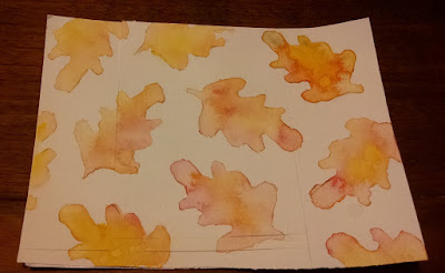
The first class had us using one of our dies to outline shapes in pencil for an all-over background.  The teacher used a pear shape, which I don't have.  I looked through my dies and found this leaf die, and drew my leaf shapes on Canson Cold press 140 lb Watercolor paper.

I painted one of the shapes with clear water, and dropped in several colors, and let the water blend them.  I then moved on to the second leaf, and tried again, going from leaf to leaf.


The first one (upper right) didn't really look good to me.  I had added drops of cadmium yellow mostly in the center, then a couple of drops of a green I had blended from cadmium yellow and ultramarine. 

On the other side of the leaf I added drops of alizarin red.  When I tilted the paper the red and yellow sort of formed an orange, but I didn't like the way it looked. When I added a little more water to the yellow, I think it had already dried a little and lines showed up.  And I don't know how the yellow dot showed up.

The next one I did (right side, just under the first one) turned out better.  There is just the one spot that seems to have a harsher line than I intended, but I can see the improvement.

The rest of them I rather like how they turned out.  I used more water on the paper as I went along, and I see that the last couple are a little too pale and blended for my taste, probably because there was too much water to begin with.

To make my card I trimmed down the watercolor paper to 3 3/4 x 5 inches (which eliminated the leaf I didn't like), then matted it with a nice reddish brown.  I tied a ribbon around it, and popped it up for a little dimension on my brown card base.  I think it turned out pretty well.

The die I used was from Dare2B Artzy, and the paints were Windsor Newton Cotman watercolors (tube).


Thursday, November 19, 2015

Online Card Class Day 3--Classic and Elegant

Another card for my online class.  Really enjoying all the new ideas I'm getting from this class.  Here is my take on the Classic and Elegant card.  It is a simple design using the Hero Arts Color Layering Christmas Tree.  I trimmed the top panel to 3 3/4 by 5 1/2, and adhered a narrow gold ribbon to each side.  The panel was attached with foam tape to the top folding card base. I will be attaching some red gems to the tree (as soon as I find them again)!  If I can't find the gems, I may be using red stickles to give the tree a little more color!


Tuesday, November 10, 2015

Online Card Classes--Holiday Style Day One--Clean and Simple

 Love the Online Card Classes I've taken so far, and this one is shaping up to be another.

The first class was clean and simple, and I liked the technique Julie used for her trees.  While she made it a one layer card, I had the Tim Holtz Crazy Birds stamps with matching dies, and wanted to try them out.

I masked a snow hill on the bottom of the card front, then colored the sky with Simon Says Stamp steel blue ink, using a stipple brush to, I hope, look like a swirling snowy sky.  I then stamped a tree (from Hero Arts Sending Holiday Cheer stamp set) several different times,  using first and second generation stamping to get color variations.  I was hoping to give the card the illusion of distance for some of the trees.

After stamping, coloring, and die stamping a bird, I stamped and colored a Santa hat and candy cane, also from Tim Holtz. Since I don't have the dies for this set (yet), I was forced to cut out by hand.  I'm not good at this, and the die set is definitely going on my Christmas list!!

I glued the hat and candy cane to the bird, then glued it to the front of the card front I had made. I stamped the sentiment from Tim Holtz on the front, and used a sentiment from the Hero Arts stamp set--may your home be filled with the joys of the season--for the inside.  The sentiments were stamped in Momento Tuxedo Black.

The front was trimmed to 5 1/4 by 4 inches, and was then attached to the card front. 


Tuesday, September 29, 2015

Watercolor Class Day 2--paints--One more card

I stamped a flower design I liked with VersaFine ink, and the sentiment.  I then attempted to color in the flowers with my tube watercolor paints ( Winsor-Newton) using crimson.  I diluted with water quite a bit to go over the flowers, and then when dried, went over again with a slightly less diluted paint of the same color to add some shading.


All in all, I think it came out fairly well.  I've never used these tube paints before, and found them a little intimidating at first, but just pushed on, and I feel that the result is a lot better than I had envisioned!

Monday, September 28, 2015

Another card colored with my watercolor pencils

This was based on one I'd see somewhere, I can't remember exactly where--perhaps on Pinterest, or on one of the Facebook pages I'm a member of.  In any event, they had taken the snowman and made him into a wobbly card, which I thought was cool looking.  As I wanted to do a little more with my InkTense pencils for my Watercolor for Cards class from Onlinecardclasses.com, I chose that medium to color my snowman. 


I stamped the snowman on two pieces of watercolor paper, and colored both of them with my Derwnt InkTense pencils.  I cut out the best looking one, attached a wobbly spring to the back, and added to my card front.  It is really cute in real
life!


Saturday, September 26, 2015

Another card with watercolor pencils

Using a few stamps from Peachy Keen Stamps' Lisa Jean Halloween set, I made a little Halloween scene with matching sentiment.  After stamping with VersaMark, I embossed with Zing! Opaque Black embossing powder.

My watercolor paper warped some during the heating process, but I managed to mostly flatten it out again before attempting my water coloring.  I used Derwent Inktense pencils, and tried to use a light touch, and it seemed to go okay.

I was attempting to do a little shading, and it was a little harder than I had hoped.  The cauldron didn't come out exactly as I had pictured it, but I guess it isn't too bad.  I thought the face turned out pretty well, but it doesn't show that much in the photo.  In real life, you can see it is darker around the edges, and lighter in the middle.


Thursday, September 24, 2015

Online Card Class: Watercolor Day 2--paints

Went back and watched the Day 2 videos again, and decided to try the "dreamy" background.  I used Prang Oval 16 semi-moist watercolors on Canson Watercolor paper.

First I did a light yellow wash, and after it dried, I added some more yellow, let it dry, and then a third layer of yellow.  I decided what the background needed now was a little orange, so that was next.  When the orange was dry, I used the brush to flick a few yellow droplets on top, and then some orange droplets.

I stamped with black VersaFine Onyx Black a Tim Holtz saying, Be an Individual.  I had to stamp it twice, and it it didn't make a great impression on the watercolor paper.

To finish it off, I matted it in yellow, and used foam tape to attach to the off white card base.

I was pretty happy with the way the  background came out with the layers, and using the traditional paints wasn't as hard as I thought it would be.

Wednesday, September 23, 2015

Online Card Class--Watercolor Day 3 Watercolor Pencils


I didn't get a chance to watch the Day 2 videos until last night, so didn't do any water coloring yesterday.  Today, the Day 3 videos were available, so I watched them this morning.  As I had just received my Derwent Inktense ink pencils, I was eager to try them out, so I skipped the pan water colors for today.  I'll be trying some of the techniques out for that tomorrow.

I had this idea to emboss some watercolor paper with a butterfly folder I had on hand by Darice, and then color in the design with the pencils before spritzing it with a light mist of water. 


As it turned out, some of the colors bled into the background a little, and I had to use a brush to aid in the blending I had imagined.

I also wasn't happy with the blending on the largest butterfly, so I added a little more color and used water on a brush to blend it.  All in all, after it dried I liked how it turned out.

I stamped a Thinking of You Sentiment from My Sentiments Exactly in Hero Arts Pool ink in the upper corner, matted it on avocado green card stock, and used foam tape to attach it to a cream colored card base.

It was pretty obvious to me that I need to practice quite a bit on my coloring with the pencils, as I don't seem to be using consistent pressure, causing some places to be darker than others.

I'll be doing some Day 2 cards with pan watercolors shortly, and probably some more watercolor pencil cards.


Tuesday, September 22, 2015

Another card from Day One

This was made from the second watercolor strips card I made on the first day of class, and I was hoping it would turn out a lot better than the first one I'd done, as I was using a better watercolor paper.  However, I couldn't really see all that much difference, and so I was a little disappointed.


Looking at it, I thought I'd cut it down into a circle and stamp a flower on it.  Using the Simon Says Stamp largest Stitched Circles die, I cut out a nicely colored section of the strips.  I then used Onyx Black VersaFine Ink to stamp the flower stamp on the circle.  I attached it to the center of a white A2 card base.

When I stamped the Thinking of You I tried to curve it a little to match the curve at the bottom of the circle die cut, without being too obvious about it.  I think it turned out pretty well.