Wednesday, November 16, 2016

Needed a couple of sympathy cards, and found I didn't have any left.  Made several very similar cards, the only difference being the colors.


I cut out the shape with a die, then used distress ink to add some color to the die cut.  Stamped with a tree stamp, then attached to a coordinating background mat, which was then adhered to the white card front.  Besides this blue, I made green and purple. 

Monday, October 17, 2016

Another Crazy card


Here is a Tim Holtz Crazy Dog card, with sentiments by Dylusions.  It was possibly influenced by all the political things going on.  Colored with Copic markers.


Monday, October 10, 2016

Monday cardmaking

Decided to make a couple of cards today to start off the week.

The first card features Tim Holtz's Crazy Cats, with a sentiment from dylusions.  I'm pretty happy with the way it turned out. I colored the cats with copic markers, and didn't fuss much with the shading. 


After taking the photo I decided it needed another couple of lines to indicate the floor, so I added them.  I think it really added something.

Wednesday, October 05, 2016

With love at Christmas

One of the challenges for World Card Making Day at The Stamp Nation was to make a card with something to do with weather.  As I've been trying to get my Christmas cards done, I thought a card made with snowflakes would satisfy both requirements.

Thus, my Christmas card, "With love at Christmas"  was created.  The stamps I used are from Simon Says Stamp ( Cute Snowflakes) and the sentiment is from the last Stamp of Approval (Candy Cane Lane--Catherine Pooler Designs).

I embossed the snowflakes with silver embossing powder on some blue card stock, and did the same for the sentiment. The snowflake panel was glued flat to the white card front. I matted the sentiment with white, and attached with foam tape to the snowflake panel.

Fairly simple, but I think it came out pretty well.

Monday, October 03, 2016

Shaped Cards

Taking an online card class called Wild Card, and learning about different types of cards to make.  Lesson one included shaped cards, gate-fold cards, box cards and wobble cards.

I started with the shaped card idea, and made two of them, both the same shape, but used a different stamp on each.

I used my dies to cut out four large labels, and following directions attached the backs to the fronts.  I left the die in place while blending distress inks over card front (mowed lawn on one, and peacock feathers on the other).

I stamped the green one with a trees stamp (Stampin' Up) to make a sympathy card.  I haven't decided whether or not to stamp the front with a "with sympathy stamp", or leave it as is.  For now I'm leaving it.


The second one I blended with Peacock Feathers ink, and thought it came out pretty nicely.  I then stamped it with a bird (Stampin' Up) to fulfill one the World Card Making Day challenges on The Stamp Nation.


Fairly happy with how these came out, although I messed up a little on the blending as I hadn't done it much recently.

Entered this at the World Card Making Challenge at KatScrappiness Blog.


A Little Pink Christmas

My Stamp of Approval box arrived a bit ago, and while I opened it and admired the contents, I was busy with other things and until today hadn't managed to make anything from it.


Using the label die to cut out a white label, which I inked with Angel Pink Momento along the edges.  Using the "Wishing you a", "Merry", and "Christmas" stamps, I stamped the label with Versamark ink, added Recollections Sparkle embossing powder, and heat set.  I did this twice, to make the sentiment really shine.

I stamped the card front with the Pink Angel Momento using the striped background stamp before attaching a 1 1/4 inch strip of silver glitter paper to the front.  The label was added with foam tape to add dimension.

I was pretty happy with how this turned out, even though it wasn't done in traditional Christmas colors. The picture doesn't do it justice, as it appears to have a yellowish tinge to it, and in real life it is white.


I entered this card in the World Card Making Day Challenge at KatScrappiness Blog.

Sunday, October 02, 2016

A little sass

While I'm still using papers from my Simon Says Stamp August 2016 card kit, I decided to use a new sentiment stamp I had gotten from So Suzy Stamps.


My first card just used a couple of strips that I cut from the leftovers of a previous card, with the sentiment stamped on white and matted on a dark blue scrap from the kit.  I also stamped a few of the little solid stars in red to make make it pop a little.  The sentiment is attached with foam tape to add dimension.  When I find my sequins or enamel dots, they will be scattered on the front.


For the second card I used the full sentiment, including the lady.  The papers were all from the kit.  I like how it looks so different from the first card I made.  I think this is my new favorite saying, and think I will be making quite a few cards with it in the near future!

I entered this card in the World Card Making Day Challenge at the  Kat Scrappiness Blog.

Thursday, September 29, 2016

Thinking of you

There were some constellation type stars in the kit (stamped in Chipped Sapphire), so I used two of them, plus a few smaller solid star stamps (stamped in Festive Berries), along with the sentiment thinking of you stamped in Momento Tuxedo Black. I matted it in the dark blue card stock included, and attached with foam tape to the striped paper I used for the card front.  Another card that can be sent to either man or woman.

Wednesday, September 28, 2016

Playing with my kit

The Simon Says Stamp August kit had a lot of stars, including a star die.  The die doesn't cut out the star outline, merely some stripes inside a star shape.  I cut one of the papers included in the kit to 5.25 X 4 inches, and die cut the star from it.  I glued a square of red to the card front behind where the cut would be, then added the die cut front with foam tape.  I used a white scrap of card stock to stamp you're a star in black, then cut it in a banner shape.  I stamped a few stars in the Festive Berries Distress ink included, matted it in red, and attached to card front. 


Tuesday, September 27, 2016

Masculine Card

I received the Simon Says Stamp August kit several weeks ago, and finally decided to make some cards from it.  I started with a  thinking of you card, and wanted it to be suitable for either a man or woman.
I used one of my pre-made card bases (I make a bunch at a time out of heavy white card stock from Michael's).  Using the kraft card stock from the kit, I blended the chipped sapphire distress ink over it.  There were several different resist designs included on the card stock that came with the kit, but the distressed looking dots were the one I chose.
I cut it out at 2.25 X 4.25 inches, and then matted it with the red card stock from the kit cut to 2.75 X 4.75.
Using the "thinking of" and the dots and stars stamps, I stamped them in the chipped sapphire.  I used the festive berries distress ink to stamp the word you on a 1.75 X 3 inch scrap of white card stock, and then matted it in the same red ( cut 2.25 X 3.5 inches) I matted the kraft card in.
The kraft unit was glued directly to the card base, while the sentiment was attached with foam tape for a little dimension.

It still looks a little plain to me, so I will be adding some enamel dots in red and blue as soon as I find them again.  

Wednesday, August 17, 2016

Entry for Stamp of Approval

A photo of one of my cards I made from the Stamp of Approval kit, really liked how it turned out!  The blended background of the frame was a little tiring, I need to learn to relax my hand more!


Saturday, July 16, 2016

July 2016 Stamp of Approval box arrived!

My SOA Lovely Notes arrived yesterday, and I made a few cards.  I love the Concentric Circles die!
And the stamps are pretty neat, too.


I started out by using some Distress Inks in a rainbow pattern on some white card stock, then cut out the Concentric Circles.  For my first card I centered the rainbow die cut on a 4 x 5.25 inch piece of black card stock, then attached to the front of my card base.  Using a scrap strip of black card stock, I wrote with a white Signo pen my sentiment.  After rounding the corners, I used dimensional tape to give it some height.  I am really pleased with this card.

 
I also cut out the die on a piece of black card stock. I heat embossed in white my sentiment on the black die cut.  I attached the leftover piece of rainbow card stock to the front of my card base, then inserted the black die cut in the opening.  I then attached all the leftover rainbow pieces in the appropriate places in the black die cut.  A little time consuming, but not hard to do.  And I think the card turned out pretty nice!


For my third card I blended some Distress Inks on white card stock, then cut out as panel using the outline die that comes with the Concentric Circles die.  I stamped it using the Fill in the Blanks stamp in black.  After cutting a 4.25 x 5.5 inches rectangle from black card stock, I attached it to the front of my card, then centered the stamped piece and attached that.  I used the included word stamps to personalize it for my son-in-law, whose birthday is in a few weeks.  I think it turned out pretty masculine looking, although maybe a little bright.  But then again, I really like bright.


My last card for today was the leftover frame from cutting out another of the Concentric Circles.  Unfortunately, the circles did not make it out of the die in one piece (my fault, not the die's, I was rushing).  After attaching the frame to the front of the card, I stamped several sprays of leaves from the Lovely Notes stamps on the left side of the opening. I also stamped the sentiment in black on the right hand side of the opening. I stamped and die cut several of the large flowers, and a couple of the branches of leaves, and attached them to the left side of the card, using dimensional tape on a couple of them (and very handily covered up someone's black fingerprint).

I'm not sure why the yellow flowers seem so dull, in real life they are bright and really pop!


I'm really loving this kit!  I will be making more cards over the next couple of weeks from it!

Monday, June 06, 2016

Second lesson in my class

Having finished my first lesson, and done the homework, I was ready for the second lesson.  This lesson was on blending with the Copic Markers, and was the main reason I signed up for the Copic Jumpstart class.

First we tried shading with just one color.  Took a lot of time to get the shadows. Next up was shading with two colors.  This was less time consuming then with just one color.  Learned quite a bit from this lesson.

Shading with one color at top, and using two colors on the bottom.


Sunday, June 05, 2016

Copic Jumpstart Class with Sandy Allnock


I signed up for this class (Copic Jumpstart Class) a couple of months ago, and it finally began on May 27th.  Unfortunately, I was camping and didn't have internet, except on the rare occasion we went into town.  Therefore, I started this class quite a bit later.

I watched the getting ready videos, and colored in my hex chart to see what colors I had, and how they went together, a couple of weeks ago.  I had managed to get several of the Copic Markers that Sandy recommended, and had a few in my collection that I could substitute for some of them, so I was ready to go.

The first lesson was about color wheels, and color glazing.  It took quite a bit longer to get my homework done than I had first thought.  Here is a peek at the results I had. I first colored several color wheels using different shades, and then made a glazed color wheel, where the colors overlapped the ones next to it.  Interesting!

Color wheels I made


I moved on to doing a bunch of color glazing wheels, with one color as the base, then coloring over it in sections, using a different color in each section.  This was also very interesting, as there were a lot of different effects when trying out the different colors.  Some blended easily, some seemed to take away the base color, and others didn't seem to affect the base color very much with subtle changes.

Peek at my color glazing chart
I used the same colors as Sandy did in her example of the large glazed color wheel, with one substitution. I then used those same colors in my glazing chart.

So far, I'm loving this class.  I've already learned quite a bit.  


Thursday, May 05, 2016

Clean and Sheer Card 1

Taking another class from Online Card Classes.  I have learned something from every single class I've taken there, and I've taken a bunch!

This class, Clear and Sheer, shows different techniques for attaching and incorporating acetate and vellum in  your cards.

This card is the first card I made from this class, although it is from Day 4. I used an embossing folder with my vellum, and got a really nice design.  This is the second try, and my first try, while really cute, had several areas that cut all the way through the  vellum.


I embossed my 4.5 inch by 5.5 inch piece of vellum with a Lifestyle Crafts GooseBumpz folder called Whimsy.  After trimming off the edges I was left with a 4 inch by 5 inch piece of embossed vellum, which I cut in half lengthwise.

I took a 5.25 by 4 inch piece of yellow striped card stock, and added a 4 by 3.75 inch of designer paper on top, having the top edges even.  I then folded over the top edge of the vellum and adhered it to the back (an idea from Day 1), leaving the bottom loose.  I then stamped Smile on a scrap piece of white card stock, layered it on a scrap from the yellow striped, and adhered it to the front of the card with foam tape for some dimension.

When I find my scalloped border punch, I'm going to add a small light green border to the bottom of the red flowered paper to finish the card.  Unfortunately, I am in the midst of rearranging my craft room (a several month long project), and currently can not find my border punches.  (On the other hand, I have found several other tools that have gone missing over the last several years...and a few duplicates). 

Monday, February 22, 2016

Tickle your Funny Bone Stamp Club for February

  Received my first Stamp Club delivery, and really liked the stamps that were included.   I used one to make a pretty note card.

I made a card base from a dark green card stock, and accented it with a layer of a polka dot paper from my scrap pile. On the inside, I added a border with a border punch to a white piece of card stock and attached it to allow a place to write.

I then added the  stamp on white with a mat of the dark green.  I rounded two opposing corners on both, then added to front with foam tape to add some dimension.  I liked how it came out.


Wednesday, January 27, 2016

Watercolor for Cardmakers--Intermediate Class

I'm taking another online class, and after only three days I'm in information overload.  I started this class late, and now I'm in catch-up mode.

The first class had us using one of our dies to outline shapes in pencil for an all-over background.  The teacher used a pear shape, which I don't have.  I looked through my dies and found this leaf die, and drew my leaf shapes on Canson Cold press 140 lb Watercolor paper.

I painted one of the shapes with clear water, and dropped in several colors, and let the water blend them.  I then moved on to the second leaf, and tried again, going from leaf to leaf.


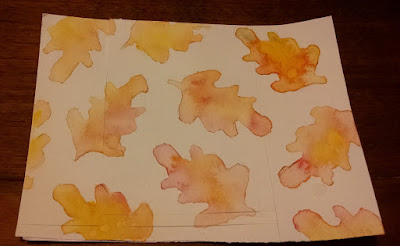
The first one (upper right) didn't really look good to me.  I had added drops of cadmium yellow mostly in the center, then a couple of drops of a green I had blended from cadmium yellow and ultramarine. 

On the other side of the leaf I added drops of alizarin red.  When I tilted the paper the red and yellow sort of formed an orange, but I didn't like the way it looked. When I added a little more water to the yellow, I think it had already dried a little and lines showed up.  And I don't know how the yellow dot showed up.

The next one I did (right side, just under the first one) turned out better.  There is just the one spot that seems to have a harsher line than I intended, but I can see the improvement.

The rest of them I rather like how they turned out.  I used more water on the paper as I went along, and I see that the last couple are a little too pale and blended for my taste, probably because there was too much water to begin with.

To make my card I trimmed down the watercolor paper to 3 3/4 x 5 inches (which eliminated the leaf I didn't like), then matted it with a nice reddish brown.  I tied a ribbon around it, and popped it up for a little dimension on my brown card base.  I think it turned out pretty well.

The die I used was from Dare2B Artzy, and the paints were Windsor Newton Cotman watercolors (tube).